Impact at a Glance
- 46% Increase in (FCR) & Signifant boost in NPS
- 32-37% reduction in payment-related support calls
- 85% user success rate on first attempt Check Florida Blue Website
My Role:
As a User Experience and Interaction Designer, I led the redesign of the Florida Blue Message Center to make healthcare communications more intuitive, accessible, and trustworthy. The goal was to simplify how members receive and act on messages while improving transparency and overall digital experience.
Over the course of three months, I collaborated with product managers, developers, content strategists, and compliance teams to streamline communication flows and align design with accessibility and brand standards. Using Figma, Miro, and UserZoom, we validated each design decision through iterative testing and feedback.
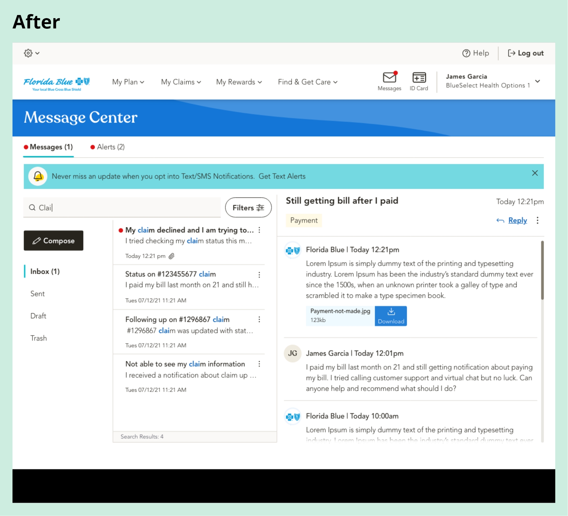
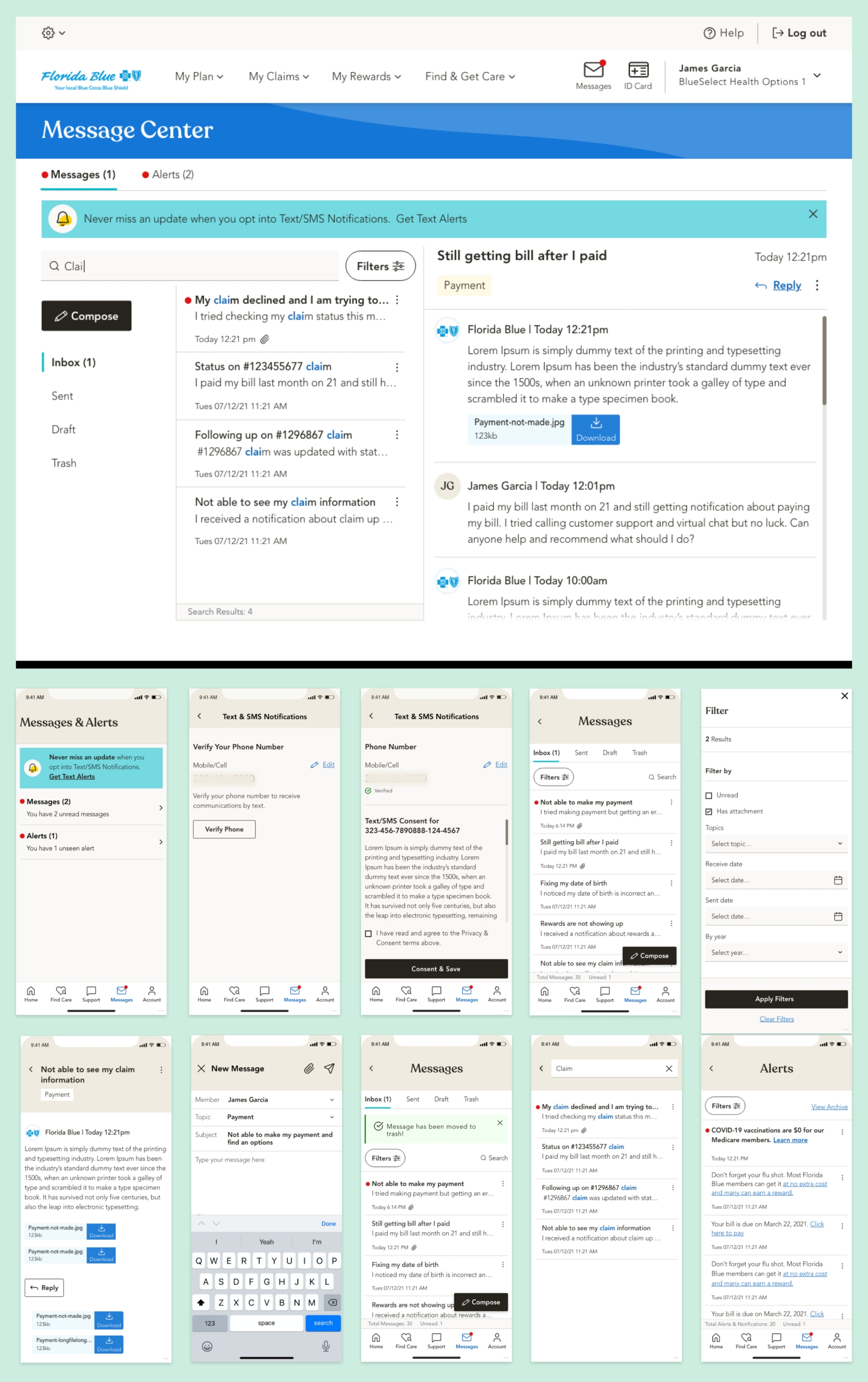
The redesigned Message Center introduced a centralized inbox, consistent message templates, and improved message categorization, allowing users to quickly identify the right category when reaching support. This helped customer service teams resolve inquiries faster and reduced unnecessary back-and-forth. The outcome was a 46% lift in First Contact Resolution (FCR), reduced call volume, and stronger member confidence in digital communication.
Tools:
Led the end-to-end user experience and interaction design using InVision for brainstorming and ideation, Figma for high-fidelity wireframes and visual design, and UserZoom for usability testing.
Team:
- Project Manager
- Product Owner
- Lead Researcher
- Visual Designer
- Development Team
Device & Segments:
- Desktop
- Tablet
- Mobile Responsive
- Mobile App
- Seg - All Member Type
Deliverables:
- Project Plan Documents
- Wireframes
- Prototypes
- Final Design Handoffs
- Usability Testing Reports
Understanding the Problem
A Fragmented Payment Experience Hurting Both Members and the Business
Problem Statement:
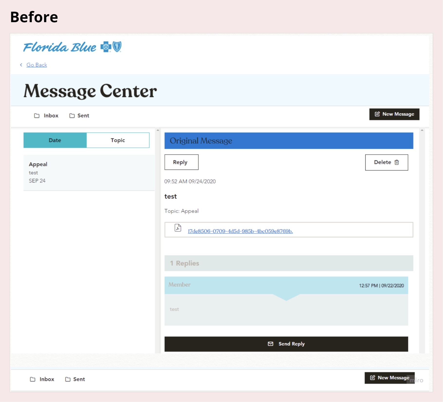
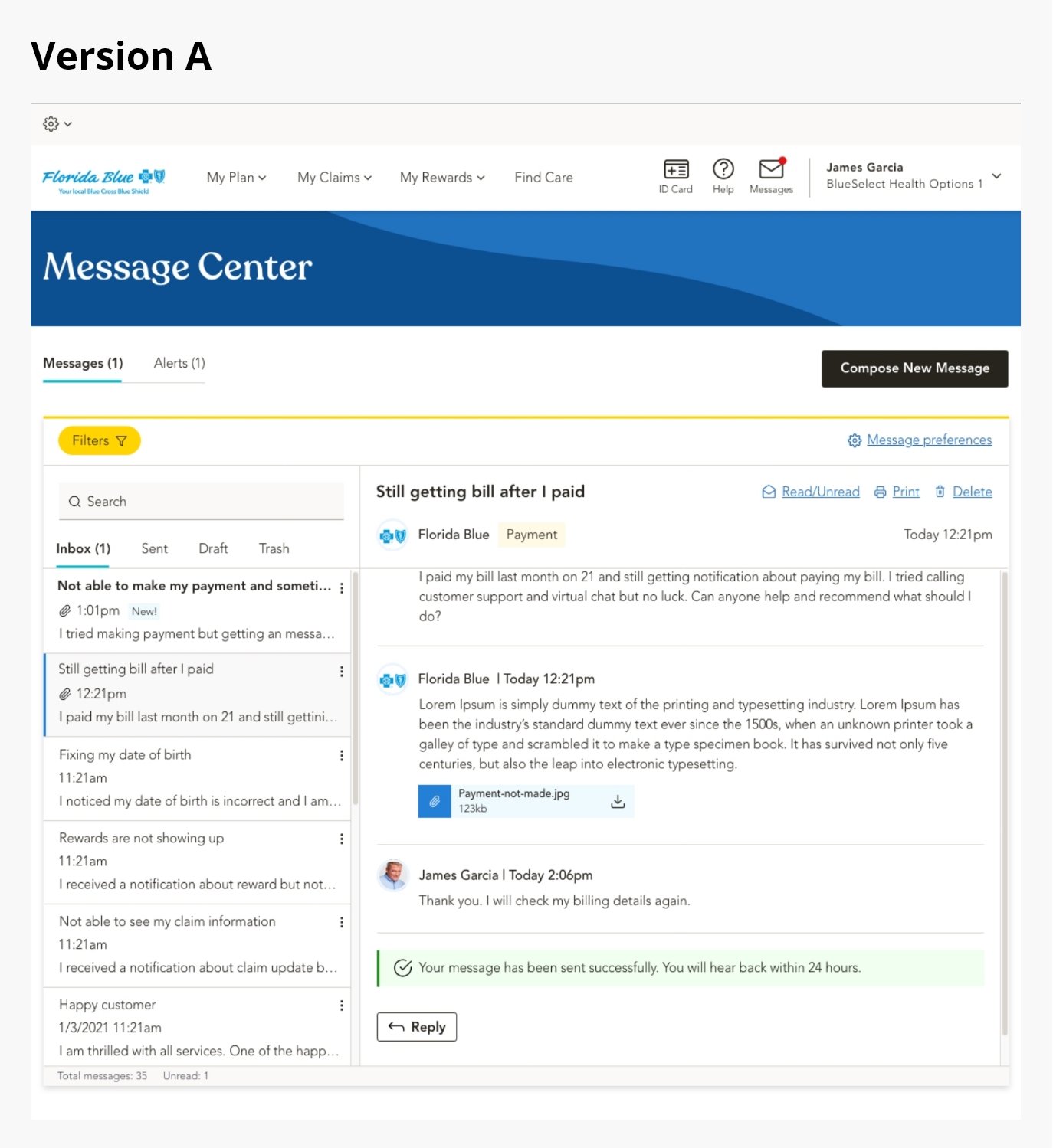
The Florida Blue Message Center created a major usability barrier within the member portal. Because it opened in the same view, members lost access to key sections such as Claims, Plans, My Account, Rewards, and Find Care, disrupting their workflow and forcing them to re-enter information. This friction caused mounting frustration, increased support call volume, raised operational costs, and compliance risks. Without intervention, it threatened member trust, satisfaction, and long-term retention.
Approach:
With a tight deadline and limited initial requirements, the Message Center redesign demanded quick thinking and strategic alignment. As the lead designer, I took ownership of uncovering the root causes behind user confusion and communication breakdowns. I began by analyzing how members, advocates, and internal teams interacted with the existing system to understand where messages were getting lost or ignored. Early observations revealed inconsistencies in message formats, lack of urgency indicators, and poor accessibility that directly impacted trust and engagement.
To build clarity, I organized rapid working sessions with product managers, developers, and compliance teams, facilitating whiteboard discussions and experience-mapping workshops to uncover workflow inefficiencies and align on priorities. I also led a heuristic evaluation and reviewed member feedback and analytics data to identify recurring pain points in how messages were received, sorted, and acted upon.
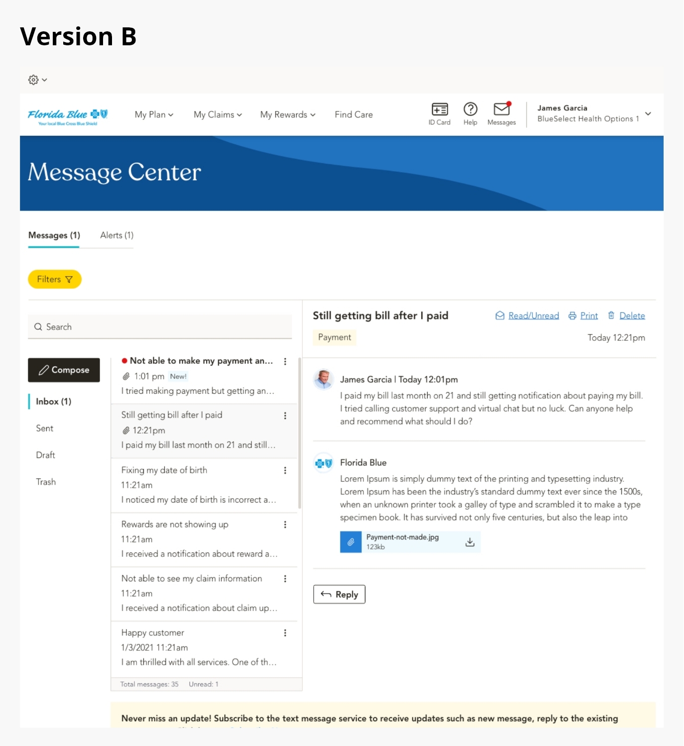
These findings guided a focused redesign centered on clarity, hierarchy, and control. We introduced a unified message hub with categorized views, clear visual states for urgent and unread notifications, and consistent interaction patterns. The result was a more intuitive experience that empowered members to manage their communications efficiently while reducing dependency on support teams.
Members’ Challenge:
Members faced a confusing and inconsistent communication experience that made it difficult to manage important healthcare messages and notifications effectively.
- No centralized inbox to view, track, or manage communications
- Promotional and critical messages mixed without clear priority
- Difficulty locating older or unread messages after login
- Lack of categorization made it hard to contact the right department
- Unclear visual indicators for new, urgent, or read messages
Business Challenge:
The fragmented Message Center design increased operational costs and limited digital adoption, impacting both efficiency and member satisfaction.
- High volume of support calls caused by missed or misplaced messages
- Advocates manually verifying member messages
- Decline in member engagement with digital self-service tools
- Compliance risks due to members missing important updates or deadlines
- Lack of consistent, trackable reporting for message performance
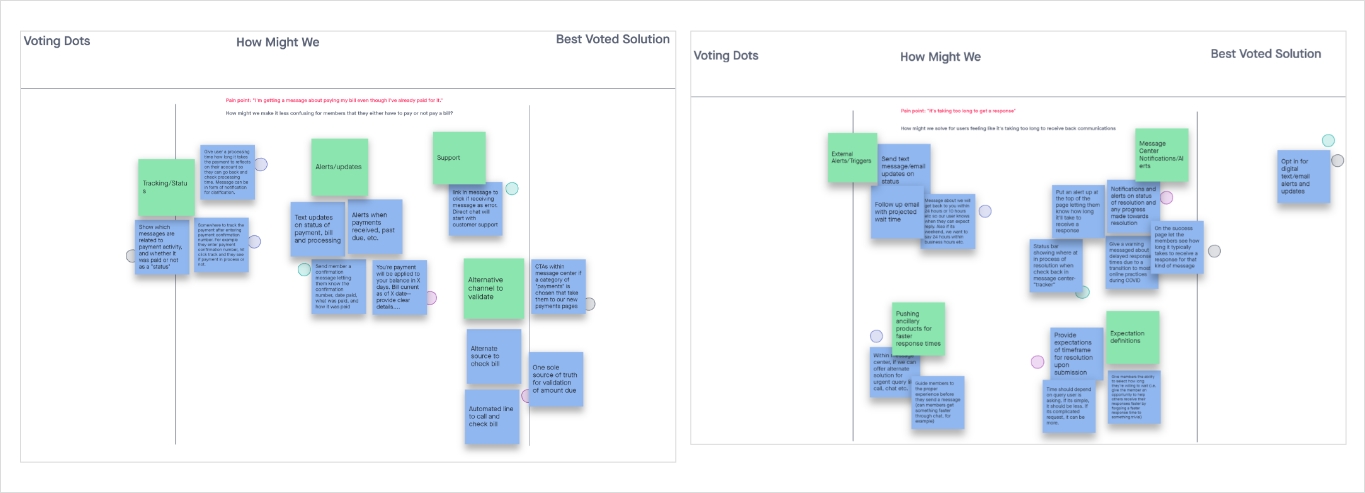
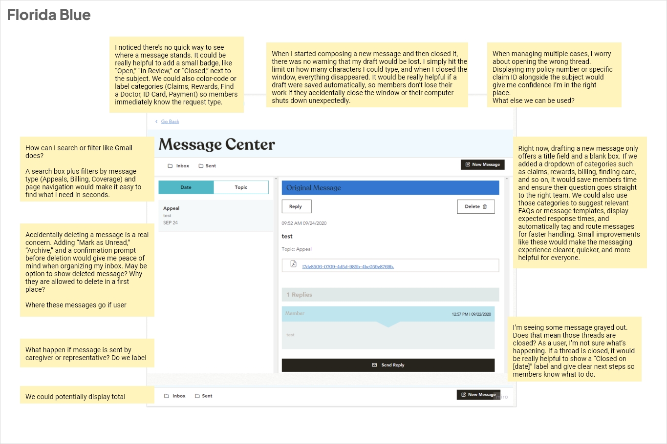
Heuristic audit and research:
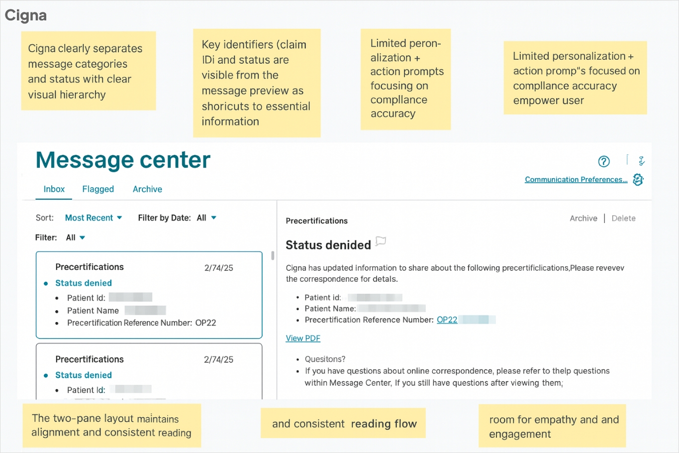
I conducted a comprehensive heuristic audit of the Message Center, evaluating each interaction against core usability principles such as consistency, feedback, and error prevention while identifying key opportunities for improvement. In parallel, I performed a competitive analysis comparing our messaging experience with leading healthcare portals like Cigna, UnitedHealthcare, and Aetna to understand how they manage clarity, categorization, and communication flow.
After documenting and prioritizing usability gaps, I collaborated with cross-functional teams through workshops to share actionable recommendations, guiding the redesign toward a more transparent, efficient, and user-friendly communication experience.
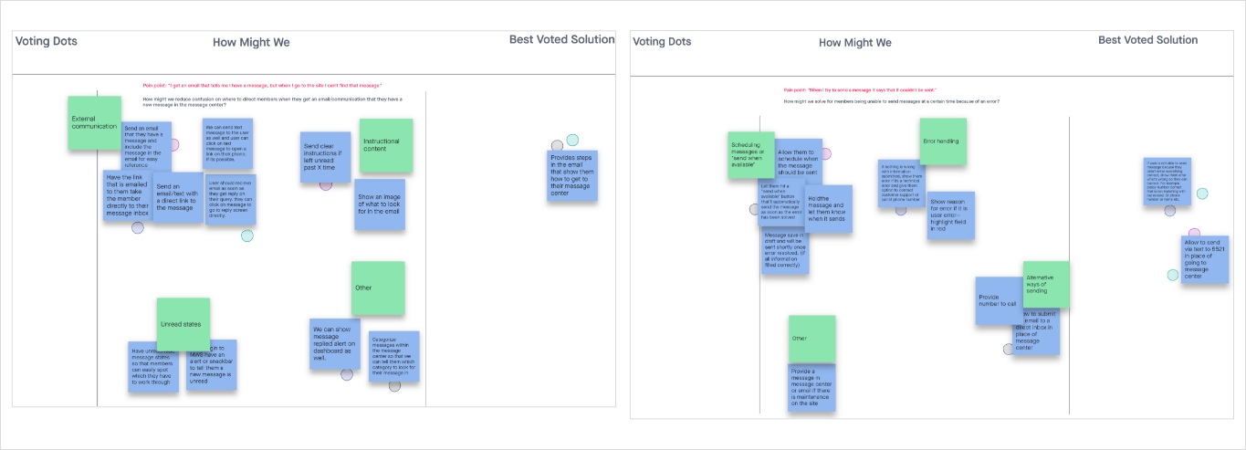
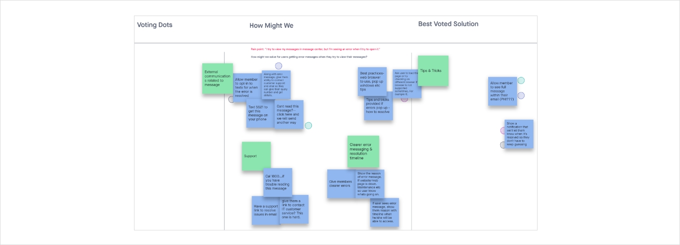
Ideation summary:
I led cross-functional brainstorming and working sessions to align stakeholders on the project vision and goals, then conducted competitive benchmarking to see how other companies tackle similar payment challenges.
After consolidating all research insights into clear design requirements, I organized whiteboarding workshops to develop and refine low- and mid-fidelity wireframes. Finally, I presented multiple prototype options to the team, gathered feedback, and helped choose the optimal design approach.