Impact at a Glance
- 41% Increase in (FCR) & Signifant boost in NPS
- 30-35% reduction in payment-related support calls
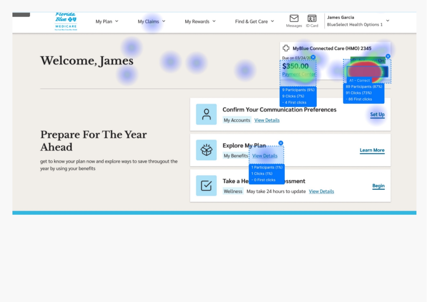
- 93 % user success rate on first attempt Check Florida Blue Website
My Role:
As a User Experience and Interaction Designer, I led the Member Payment Portal redesign for all member types, including Medicare users. The goal was to create a reliable, compliant decision-support platform that simplified complex billing interactions, reduced support calls, and built member trust by empowering users to manage their payments independently with greater clarity and confidence.
Over six months, I partnered closely with product managers and product owner, stakeholders, researchers (conducted research as well), developers, and compliance teams to identify key friction points. By reviewing hundreds of customer support transcripts, I surfaced recurring payment-related pain points that shaped our design direction.
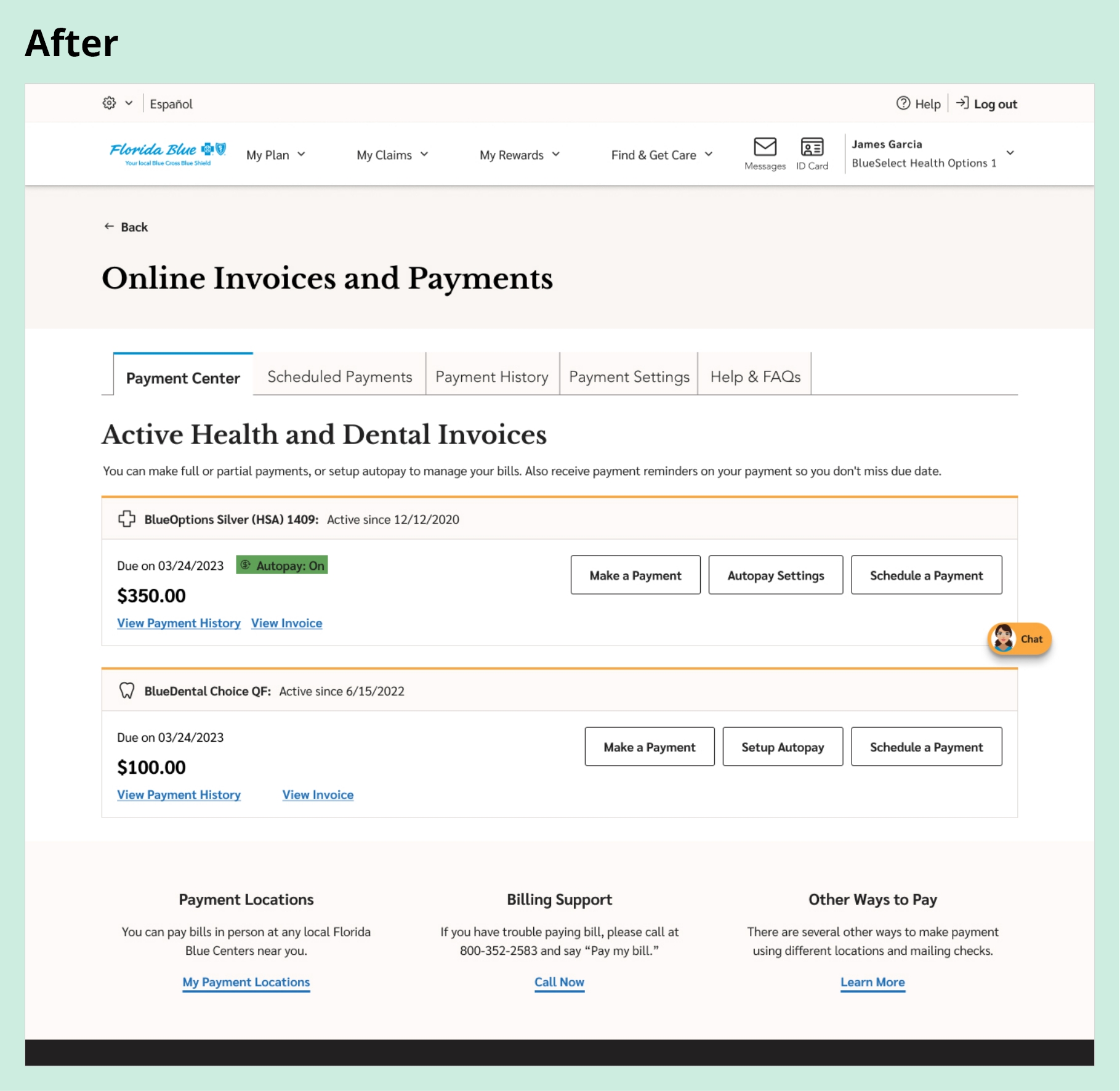
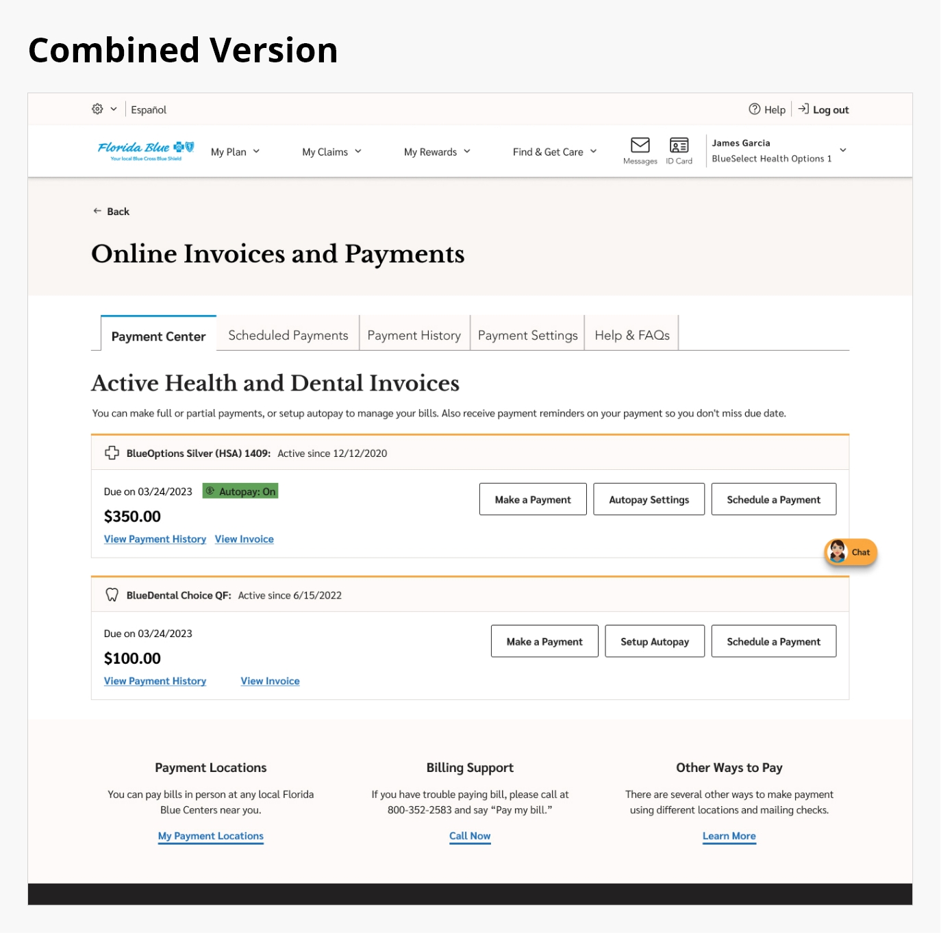
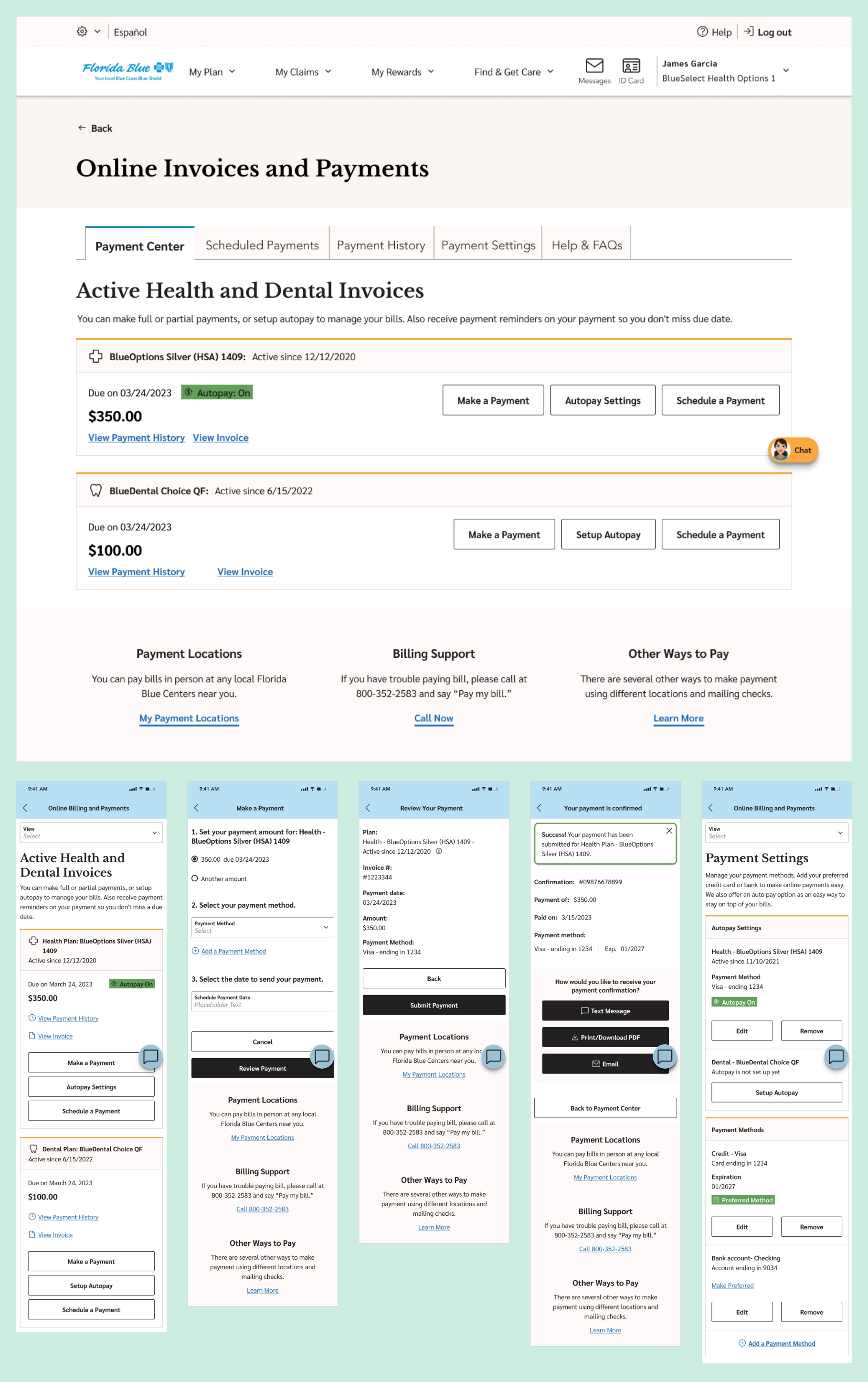
As the UX and interaction design lead, I transformed these insights into a seamless, self-service experience. The redesign unified health and dental billing, simplified payment flows, and built member confidence through clarity and transparency. From user journeys to wireframes, prototypes, and a scalable design system, the final solution achieved a 93% first-attempt payment success rate during usability testing.
Tools:
Led the end-to-end user experience and interaction design using InVision and Miro for brainstorming and ideation, Figma for low and high-fidelity wireframes and visual design, and UserZoom for usability testing.
Team:
- Project Manager
- Product Owner
- Lead Researcher
- Visual Designer
- Development Team
Device & Segments:
- Desktop
- Tablet
- Mobile Responsive
- Mobile App
- Seg - All Member Type
Deliverables:
- Project Plan Documents
- Wireframes
- Prototypes
- Final Design Handoffs
- Usability Testing Reports
Understanding the Problem
A Fragmented Payment Experience Hurting Both Members and the Business
Problem Statement:
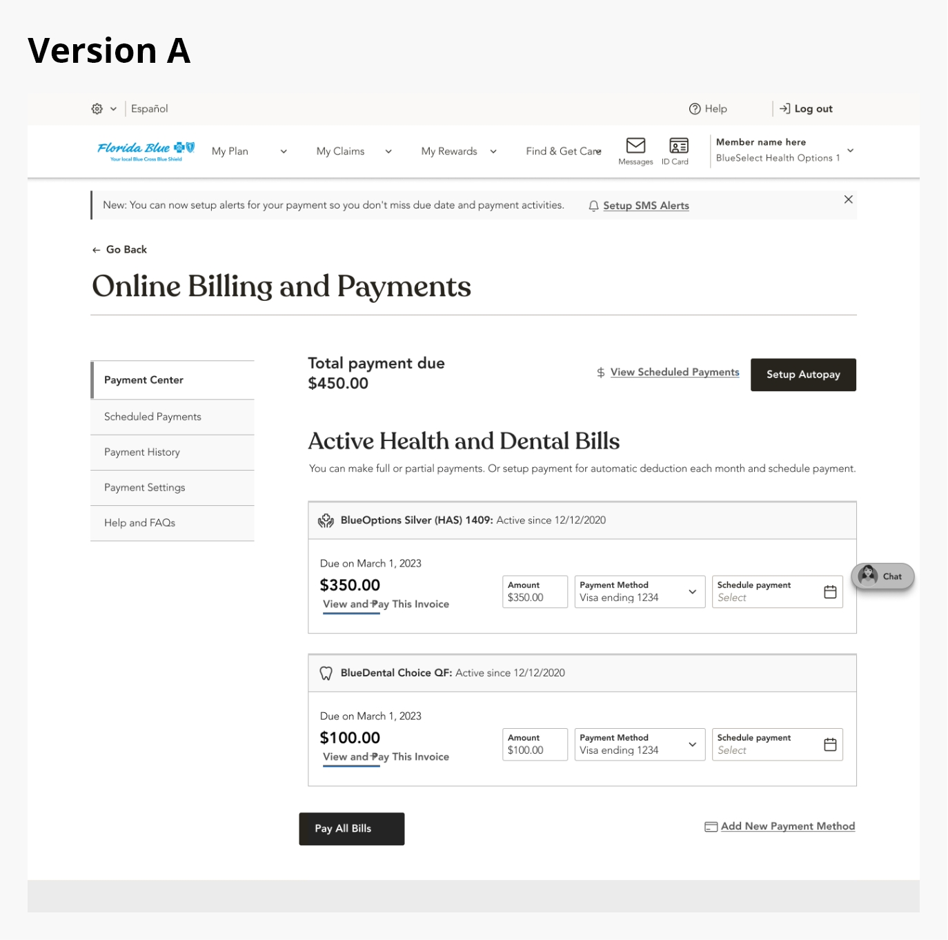
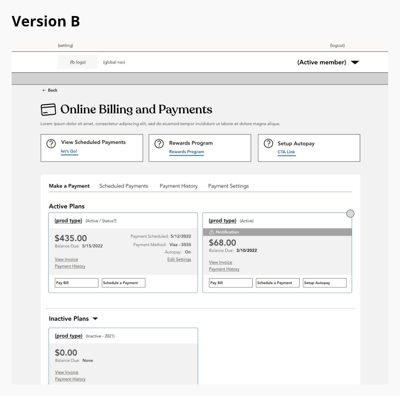
Florida Blue’s digital payment experience was fragmented across health and dental systems, forcing members to navigate multiple logins, unclear billing information, and inconsistent message feedback loops. This complexity led to member frustration, incomplete payments, and high support call volumes. The business needed a unified, self-service payment experience that improved usability, strengthened member trust, and reduced operational inefficiencies.
Approach:
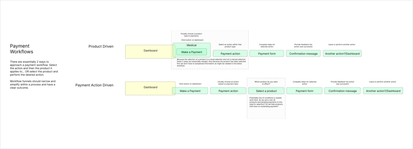
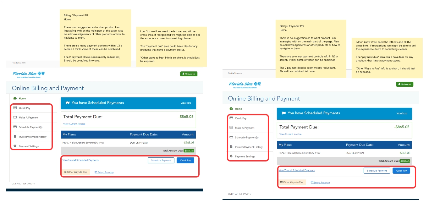
I immersed myself in the day-to-day experiences of members, support teams, and billing specialists to understand how they navigated Florida Blue’s payment ecosystem. Pain points surfaced quickly: members had to manage two separate logins and experiences for health and dental accounts, leading to confusion and missed payments. Members were also unable to navigate to other pages without logging out of the payment process, causing additional frustration. Billing statements were difficult to interpret, and limited guidance during checkout created uncertainty. Members didn’t just want to make a payment; they needed clarity, trust, and confidence that their transactions were processed correctly and on time.
To dig deeper, I conducted stakeholder interviews, reviewed members feedback, initiated heuristic audit, and analyzed survey data to identify recurring payment-related issues. Insights revealed frustration with disjointed tools, unclear messaging, and lack of real-time confirmation. What members needed was a unified, intuitive platform that simplified payment management, reduced cognitive load, and restored confidence in the process. These findings became the foundation of the redesign, focusing on transparency, consistency, and self-service empowerment.
Members’ Challenge:
Members struggled with a fragmented, confusing payment experience that lacked clarity, accessibility, and trust.
- Two separate logins for health and dental accounts
- Missing reminders and timeouts during checkout
- Confusing line-item statements and unclear success messages
- No consistent visibility into pending or completed payments
- Limited mobile responsiveness
- Payment functionality operated separately from the member portal
Business Challenge:
The disjointed billing process led to high support costs, missed payments, compliance risks, and declining member satisfaction.
- Nearly 60 % of users abandoned payments mid-flow
- High support-call volume driving uncessary cost to the company
- Revenue leakage from missed or delayed payments
- Manual workload for billing and support teams
- Declining NPS and trust in digital self-service channels
- Limited self-service adoption driving dependency on call centers
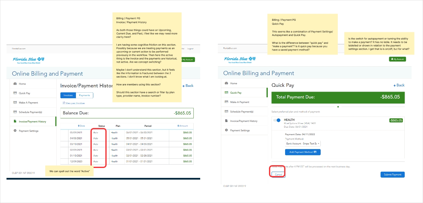
Heuristic audit and research:
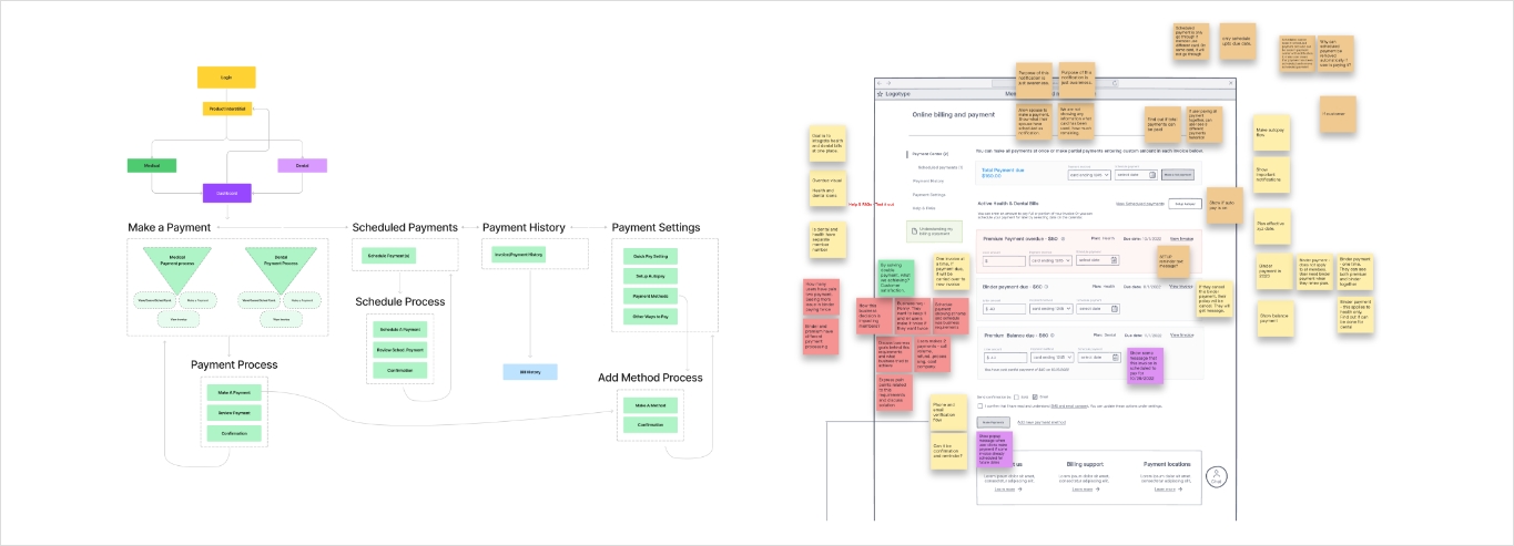
I conducted a comprehensive heuristic audit of the Member Payment Portal, evaluating each screen against usability principles such as consistency, feedback, and error prevention but most importantly, what can be improved. I also carried out competitive research, comparing our payment flows with those of major banks, electric utilities, and personal finance services to uncover best practices.
After documenting and prioritizing key issues, I shared practical recommendations with cross-functional teams in collaborative workshops, paving the way for meaningful improvements.
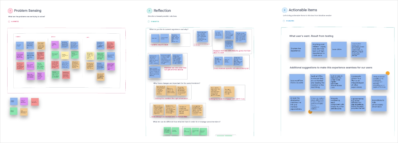
Ideation summary:
I led cross-functional brainstorming and working sessions to align stakeholders on the project vision and goals, then conducted competitive benchmarking to see how other companies tackle similar payment challenges.
After consolidating all research insights into clear design requirements, I organized whiteboarding workshops to develop and refine low- and mid-fidelity wireframes. Finally, I presented multiple prototype options to the team, gathered feedback, and helped choose the optimal design approach.