Reduced call volume & boosting FCR by 46% by early 2025.
Company: Florida Blue
Back to home page | View all portfolio items
Company function: Florida state’s largest health insurer.
Company type: Large enterprise
Company website: https://www.floridablue.com/
My roles: UX product designer | Co-usability researcher
Team involved: 1 interaction designers | 1 visual designers | 1 user researcher
Tools: Invisionapp | Figma | Miro
Duration: 4 months
Key contributions: User research & usability testing | Concept creation & ideation | Prototyping | Interaction & experience design
Member impacted: Over 10 million
Project Overview
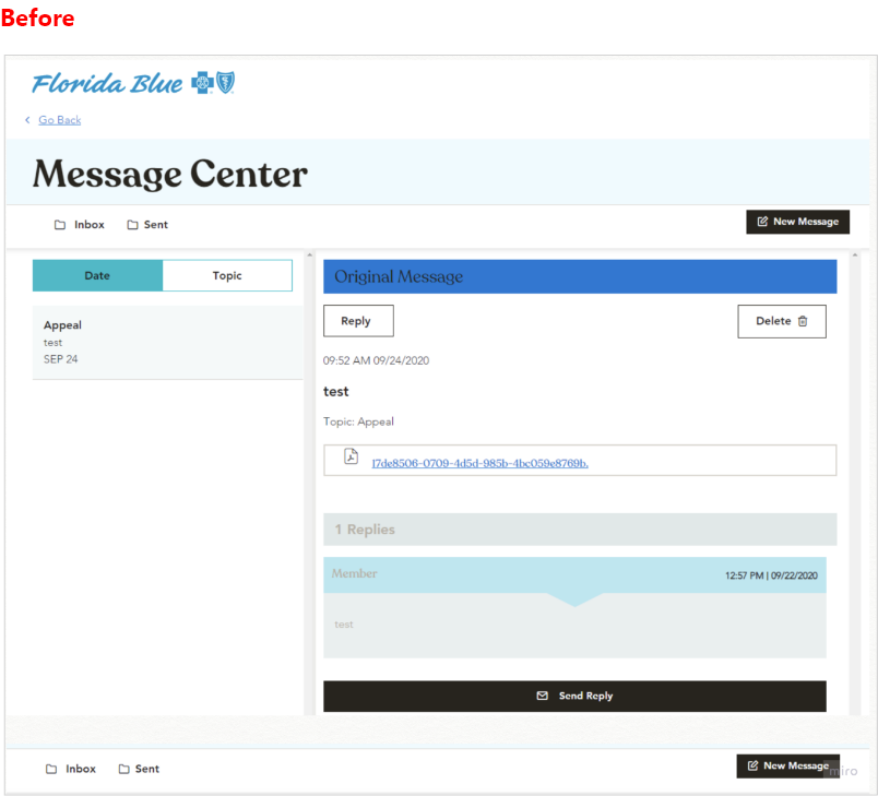
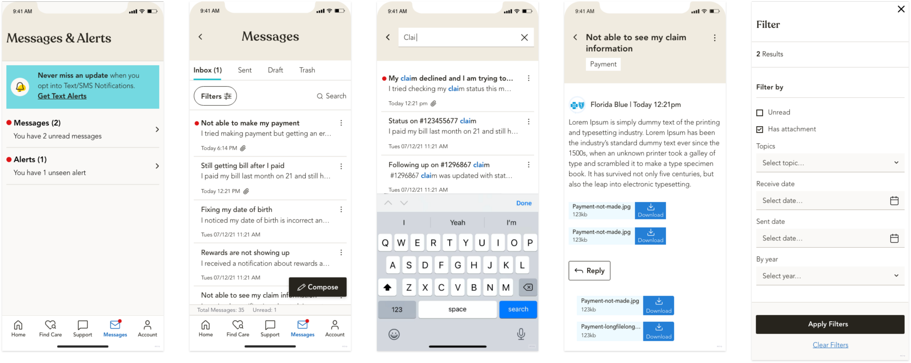
Pain Points: The Message Center’s design creates a significant barrier in our portal. By opening in the same view, it cuts off access to essential sections (Claims, Plans, My Account, Rewards, and Find Care), forcing members into a disjointed workflow of juggling tabs and re-entering information. This severe friction drives mounting frustration, evidenced by a surge in support calls, inflates operational costs, and risks missed claim deadlines and compliance issues. If left unaddressed, it undermines member trust, satisfaction, and long-term retention.
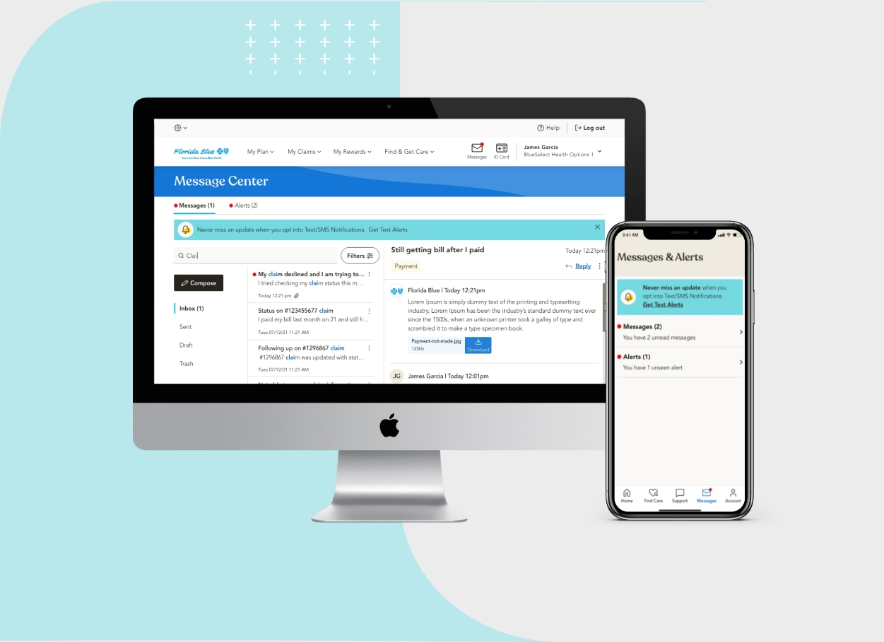
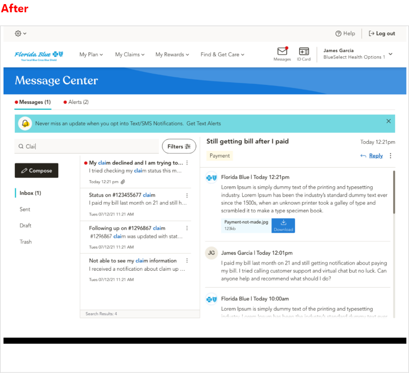
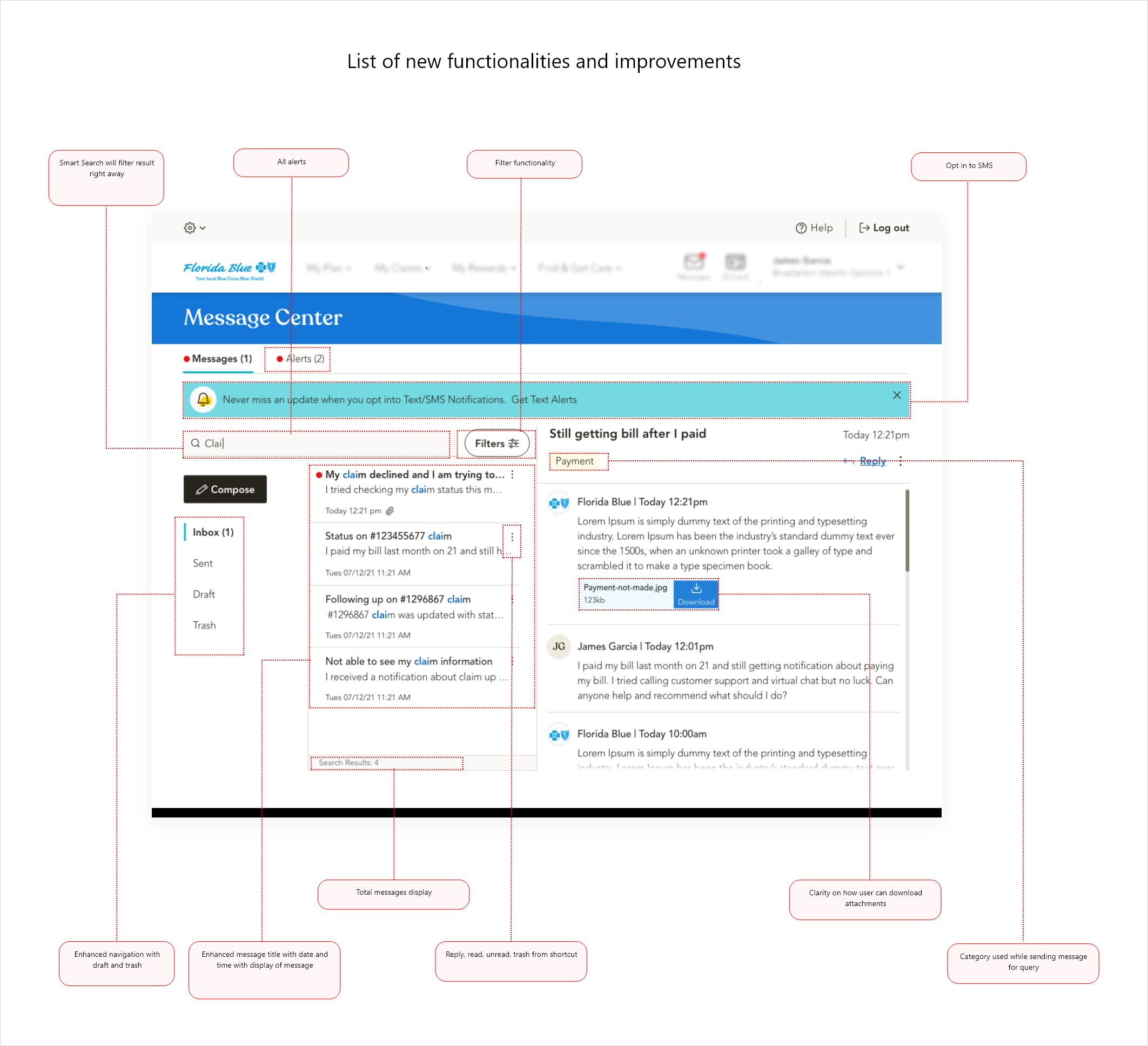
Goals & Objectives Overview: Our new messaging system serves as a central hub for all communications and notifications, with intuitive navigation and filters to switch between received and sent messages. It smartly auto-selects topics and member numbers, triggers action-based notifications, and lets users save drafts, or rely on auto-save if their device shuts down. Every message is clearly marked as new, read, or important, and a built-in text-based consent flow keeps compliance seamless, while an opt-out option puts users in control. Our goal was to empower members to resolve issues on first contact, reduce support calls, and deliver a seamless self-service experience.
Process: I began with a heuristic audit to catalog major usability barriers, then ran 2 ideation workshops with product managers, stakeholders, developers, and leadership to prioritize features and be aligned on proposed solution of adding categories and sub-categories for communication and autofill claim data. Due to time crunch, I started with high fid design, produced interactive wireframes in Figma, and validated designs through unmoderated sessions and A/B testing with 59 participants.
My Role & Impact: As lead UX designer, I owned information architecture, prototype development, and test facilitation. Partnering closely with product leaders, project managers, developers, and UX researchers, I ensured alignment on requirements, message center logic, and user needs throughout agile sprints. Within six months after the launch, we noticed positive results, FCR climbed 46% year-over-year, and average call handling time dropped while members transitioned smoothly to the new experience, with bi-weekly surveys confirming the rollout was seamless and hiccup-free.
Before and After
Impact: Measurable difference that boosted FCR score, reduced call volume and increased members engagement
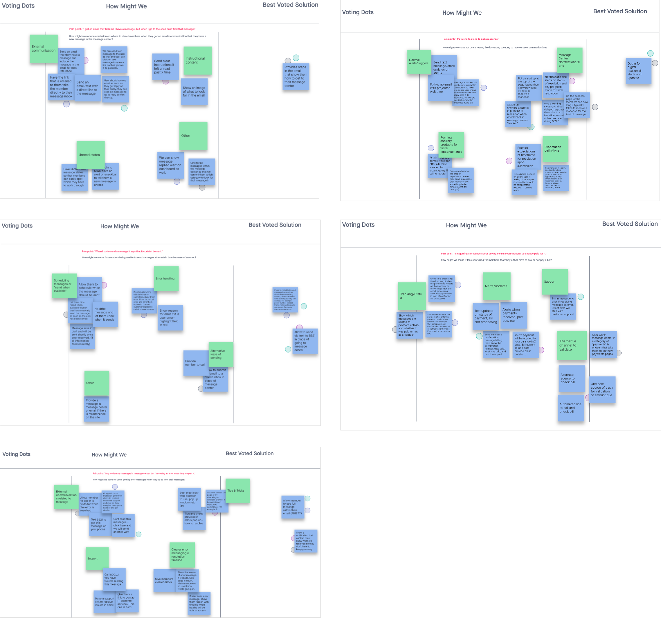
Concept and ideation summary
I led cross-functional brainstorming and working sessions to align stakeholders on the project vision and goals, then conducted competitive benchmarking to see how other companies tackle similar payment challenges. After consolidating all research insights into clear design requirements, I organized whiteboarding workshops to develop and refine low- and mid-fidelity wireframes. Finally, I presented multiple prototype options to the team, gathered feedback, and helped choose the optimal design approach.
Testing summary
Planned Methodology:
Unmoderated and A/B testing.
Participants type:
Diverse in age, ethnicity, insurance carrier, and background.
Participants count:
59 - unmoderated testing (50% U65 aged & 50% Medicare aged)
Research artifacts:
Adobe XD prototype, UserZoom audio & screen recordings
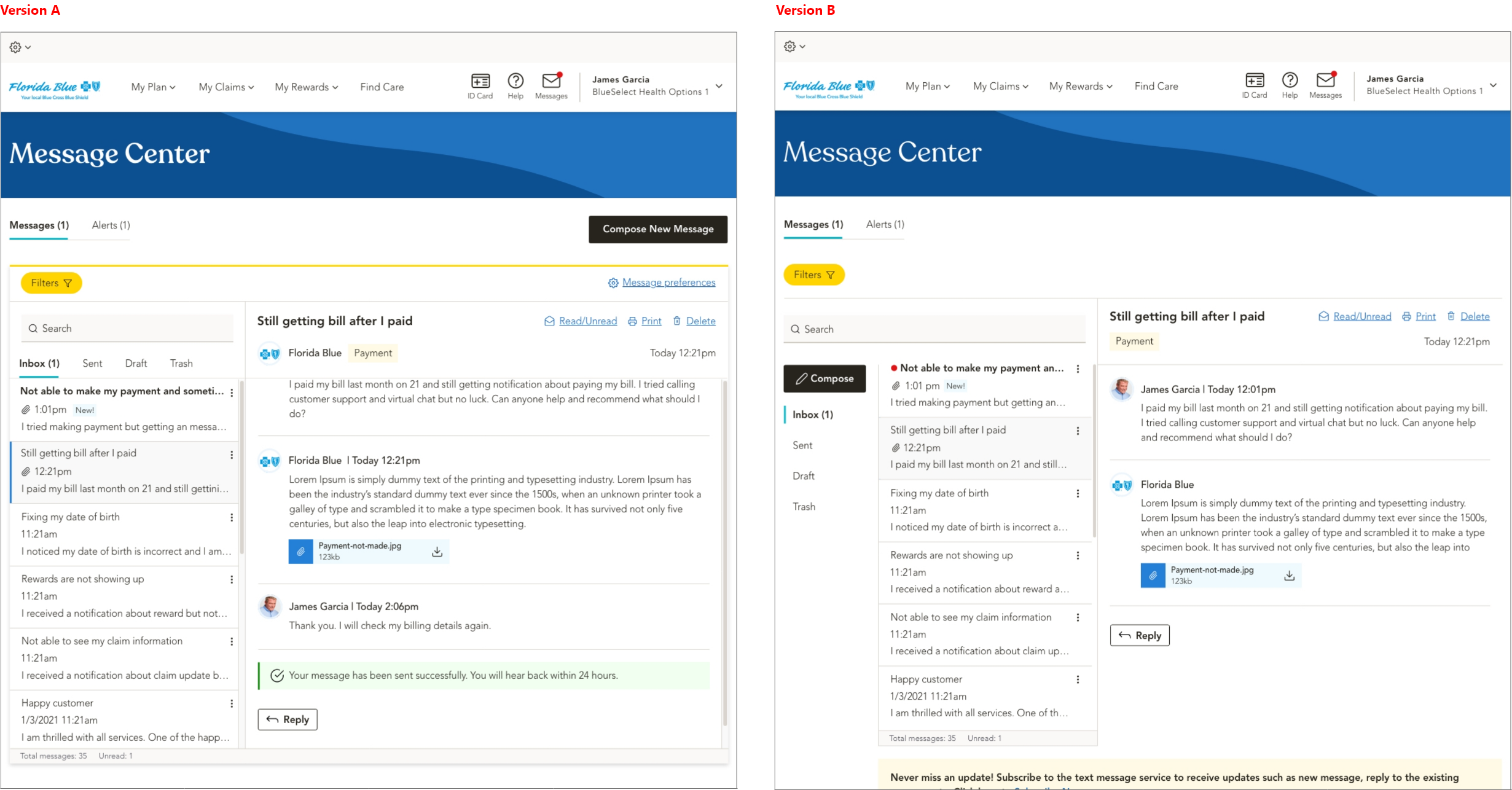
Success rate:
Version: A - 67% success rate and Version B - 85% Success rate.
Test findings
User found version B more useable and email navigation was easy to use compare to version A.
Added more clarity to the initial enrollment regarding privacy, consent, and channel opt-in during enrollment.
Users were more inclined to opt-in to Claims, Plan Benefits, Billing, and Payments notifications. Add Appeals to Claims and Authorizations to Pharmacy.
Do not provide appointment reminders; doctors and pharmacies already send them.
ll audiences found Manage Communications center would be a useful tool for them to manage preferences.
Takeaways
Centralized Hub:
A unified messaging hub that brings all communications together, making alerts and messages easy to find.
Cross-Functional Collaboration Is Crucial:
Workshops with product, engineering, billing ops, and research ensured alignment on requirements, technical constraints, and compliance, accelerating buy-in and reducing rework.
Metrics-Driven Iteration Fueled by Usability Testing:
Regular moderated and unmoderated tests provided concrete insights, identifying pain points early, validating design changes against FCR and NPS goals.
Mobile Performance Matters:
Optimizing load times and streamlining the mobile UI proved essential for busy members on the go, driving higher completion rates and better satisfaction scores.
Early & Frequent Testing Pays Off:
Ongoing usability studies caught critical issues before launch, saving time and budget on post-release fixes.
Take your project further with human-centered design. I can help, email me at: craftedbyux@gmail.com